You have spent hours upon hours creating that perfect resource, and you are now ready to upload it to Teachers Pay Teachers...but is the product really ready? Take another look at the cover. Your product cover is the first thing that potential buyers will see about your resource, and it needs to grab their attention and make a positive first impression. A product cover should be created with planning and careful consideration. It needs to be an eye-catching design that draws makes teachers want to explore more about your resource. How can a cover do that? Here are 5 tips on how to make your cover page for Teachers Pay Teachers attractive.
1. Make It Square.
The space allowed on Teachers Pay Teachers for cover pages and thumbnails is designed to be square. Be sure to take advantage of all of this available space. When the cover is not square, the cover has too much blank space that simply looks empty. Look at this example from my TpT store.
You can see the difference in the square cover and the rectangle cover. The square covers simply stand out. Also, more space means more information that you can include about your product. Now, if I could only find time to update all of my older products cover pages to square! This is definitely on my to-do list.
2. Think about Your Fonts
Use large fonts to create a product title that is easy to read. I love fancy fonts and pretty fonts, but too much can be overwhelming. Try to choose 2-4 fonts to use on your cover page. Using too many styles can look too busy. Also, using only one can be a little boring.
3. Develop Your Own Style.
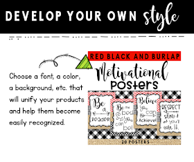
Choose one favorite font, color, or background paper to use in all of your product covers to make your products look consistent. Once you develop a style, your followers will easily recognize your products. Are you still looking for a style? Try my TpT Seller's Bundle for a coordinating set of background papers, ribbons, borders, and more that will help make your product covers not only stand out, but give your covers a uniform style.
4. Add Interest with Borders.
Sometimes your product cover just needs a little something else. Try a border! Borders are a simple and easy way to add interest and some dimension to your product cover. My Seller's Bundle (above) contains square borders that are perfect for your cover creations. For even more options
visit my store HERE or try any of the following borders from my store.
5. Use a Photo
Finally, try using a photo of your product in action. Give potential buyers a chance to see your product in use by taking a quality photo of your resource and placing it right on the cover. Doing this can make your product cover stand out from the rest and catch the eye of teachers in search of a good resource.
Creating a quality cover page for your Teachers Pay Teachers resource may take extra time, thought, and effort, but I believe that creating a quality product cover will get your resource noticed and help get your resources noticed. Of course, a quality cover is just a small part of creating resources for TpT. Creating a quality resource within the packet is very important, but by creating a resource cover that is attractive and stands out from the rest, potential buyers will see the quality and the time that you put into your resources.
Enjoy creating and have a blessed day!


No comments:
New comments are not allowed.